Vintage Poster Archives
Satomi Golf 1960 | Vintage Sport Poster
This service is currently unavailable,
sorry for the inconvenience.
Pair it with a frame
Frame options are for visualization purposes only.
FRAME STYLE
MATTING SIZE
BUILDING YOUR EXPERIENCE
powered by Blankwall
Take a few steps back and let your camera see more of the scene.
powered by Blankwall
Was this experience helpful?
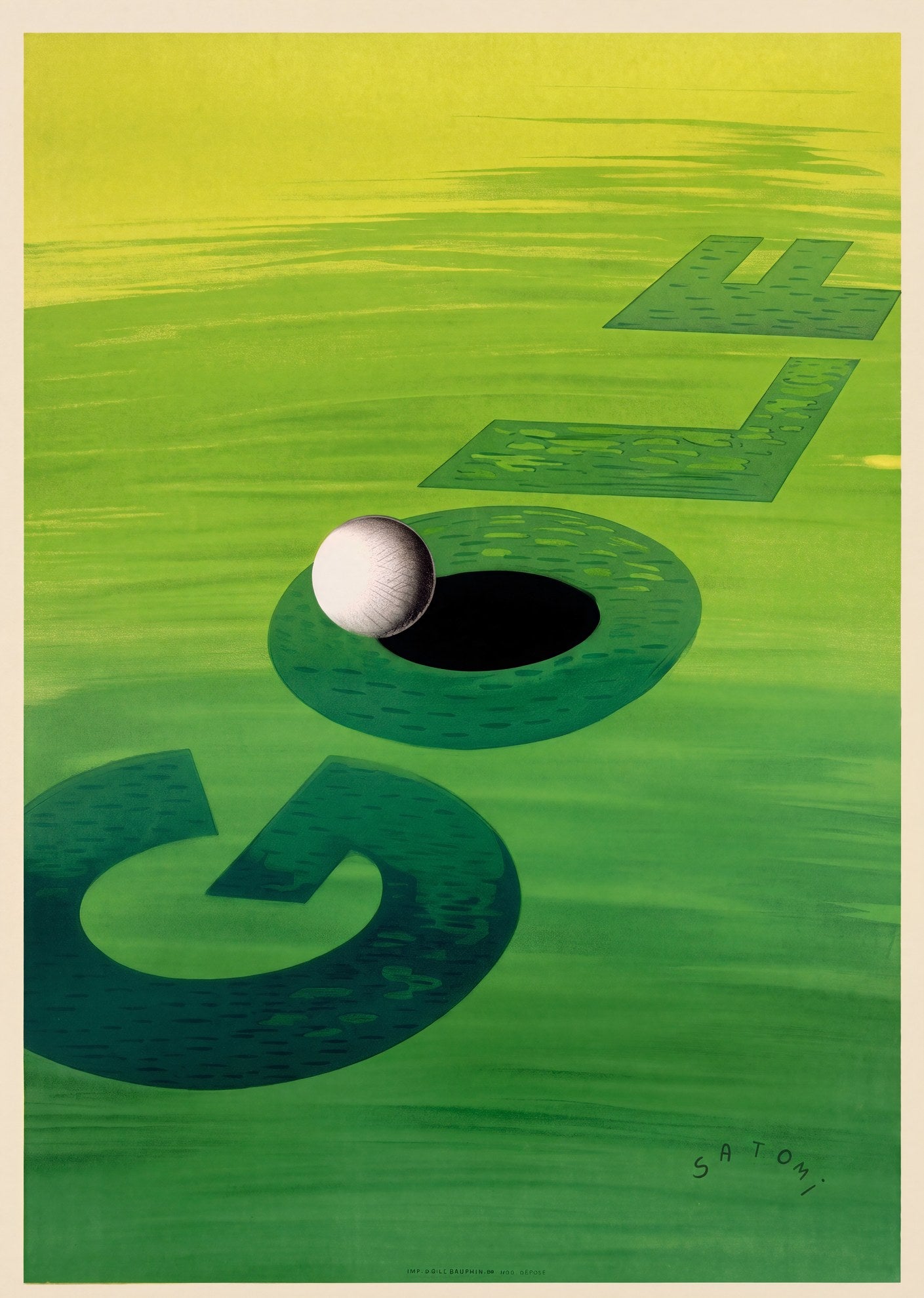
The putting green fills the entire composition in horizontal brushstroke gradients, running from acid chartreuse at the top to saturated mid-green below. Across this surface, the word GOLF is spelled in large block letterforms rendered as deep-green shadows lying flat on the turf, receding in forced perspective toward the upper right. The O in the centre is not a letter but the hole: a circular void in the green, with a single white dimpled ball balanced on its rim, half overhanging the dark space below.
Designed in 1960 by Munetsugu Satomi (1904-1996), a Japanese-born graphic artist who arrived in Paris in 1922 and studied at the École des Beaux Arts. Satomi worked briefly in Cassandre's studio in the early 1930s, absorbing the Art Deco method of distilling a subject to its graphic minimum. The Golf poster shows how completely he had internalised that discipline: one green, four letters, one ball, one hole. The sport needs no further explanation.
The approach places this work in a specific lineage: posters in which text and subject are not separate elements but a single unified composition. Cassandre's Nord Express (1927) does this with a rail track and bold lettering; Satomi does it here with typography that becomes the landscape it sits in. For a 1960 French sports poster, the restraint is notable.
This vintage golf poster design resonates with collectors of mid-century French commercial art, graphic design historians, and those drawn to the spare geometry of postwar European typography. Reproduced on 200gsm Enhanced Matte Fine Art Paper using the giclée process, from a digitally restored archival source.
Couldn't load pickup availability
Share
The putting green fills the entire composition in horizontal brushstroke gradients, running from acid chartreuse at the top to saturated mid-green below. Across this surface, the word GOLF is spelled in large block letterforms rendered as deep-green shadows lying flat on the turf, receding in forced perspective toward the upper right. The O in the centre is not a letter but the hole: a circular void in the green, with a single white dimpled ball balanced on its rim, half overhanging the dark space below.
Designed in 1960 by Munetsugu Satomi (1904-1996), a Japanese-born graphic artist who arrived in Paris in 1922 and studied at the École des Beaux Arts. Satomi worked briefly in Cassandre's studio in the early 1930s, absorbing the Art Deco method of distilling a subject to its graphic minimum. The Golf poster shows how completely he had internalised that discipline: one green, four letters, one ball, one hole. The sport needs no further explanation.
The approach places this work in a specific lineage: posters in which text and subject are not separate elements but a single unified composition. Cassandre's Nord Express (1927) does this with a rail track and bold lettering; Satomi does it here with typography that becomes the landscape it sits in. For a 1960 French sports poster, the restraint is notable.
This vintage golf poster design resonates with collectors of mid-century French commercial art, graphic design historians, and those drawn to the spare geometry of postwar European typography. Reproduced on 200gsm Enhanced Matte Fine Art Paper using the giclée process, from a digitally restored archival source.
