Vintage Poster Archives
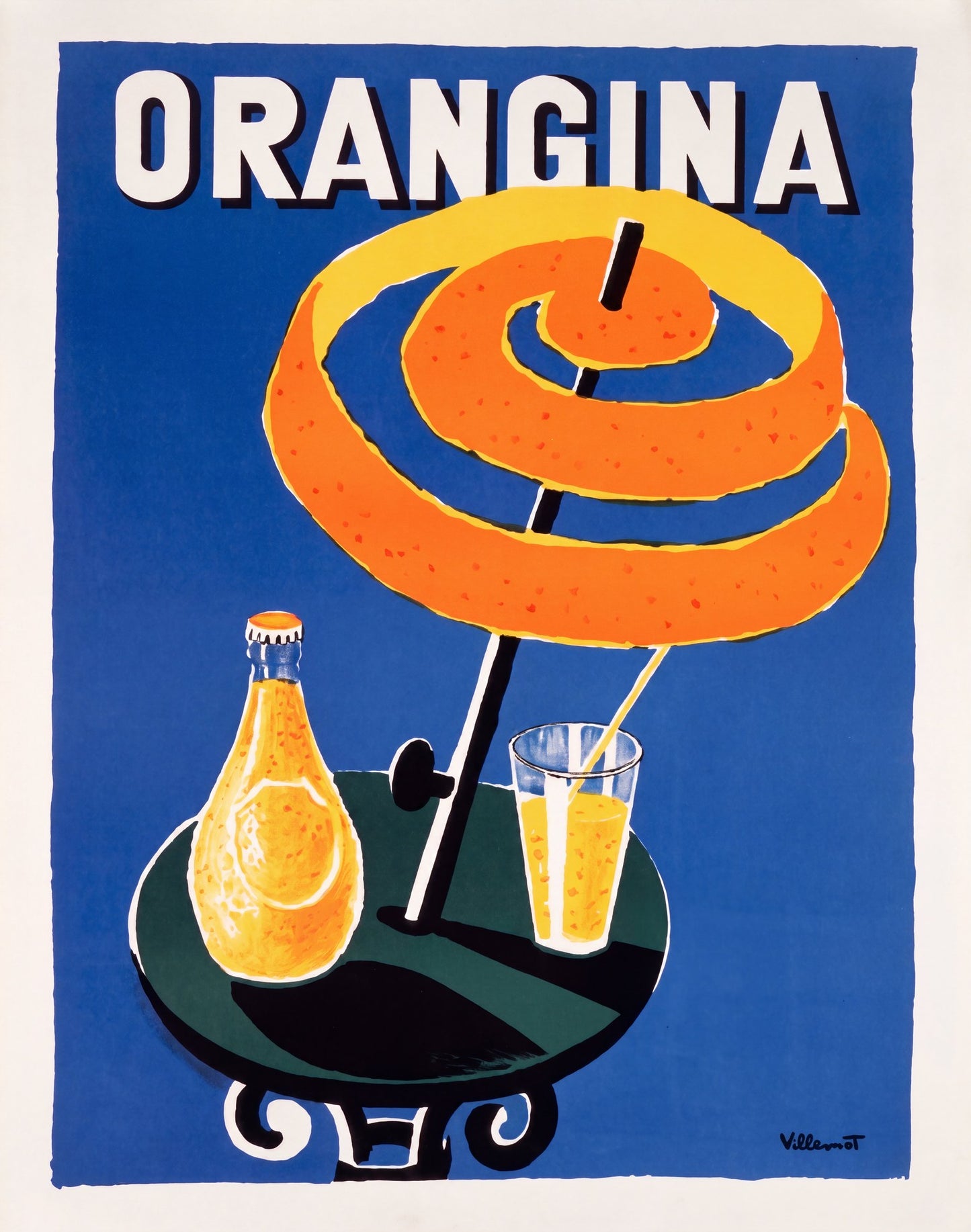
Orangina 1953 | Bernard Villemot Advertising Poster
This service is currently unavailable,
sorry for the inconvenience.
Pair it with a frame
Frame options are for visualization purposes only.
FRAME STYLE
MATTING SIZE
BUILDING YOUR EXPERIENCE
powered by Blankwall
Take a few steps back and let your camera see more of the scene.
powered by Blankwall
Was this experience helpful?
A coil of orange peel spirals into the form of a cafe parasol, the Orangina bottle and a filled tumbler arranged beneath it on a dark-green table, all set against an unbroken field of cobalt blue. The brand name occupies the top third of the composition in bold white condensed lettering with a black drop-shadow. Villemot stripped the idea of the drink to its essentials: fruit, summer light, a terrace table.
Bernard Villemot (1911–1989) began his association with Orangina in 1953, designing both the brand's logo and its poster series over the following three decades. Trained under Paul Colin, who established the flat-colour, bold-outline vocabulary of French poster design, Villemot brought a mid-century directness to every commission. The orange-peel parasol composition became the defining illustration of the Orangina brand, reproduced across French street advertising from the 1950s onward and cited by historians of graphic design as a condensed expression of Mediterranean summer. The Musée des Arts Décoratifs, Paris, held a retrospective of Villemot's work in 1963.
This archival print is reproduced on 200gsm Enhanced Matte Fine Art Paper using pigment-based inks. The smooth matte surface holds the flat colour fields without reflection, preserving the contrast between the cobalt ground and the warm orange spiral as Villemot composed them.
Well suited to a kitchen, a dining room, or any interior where a mid-century French colour palette anchors the wall.
Couldn't load pickup availability
Share
A coil of orange peel spirals into the form of a cafe parasol, the Orangina bottle and a filled tumbler arranged beneath it on a dark-green table, all set against an unbroken field of cobalt blue. The brand name occupies the top third of the composition in bold white condensed lettering with a black drop-shadow. Villemot stripped the idea of the drink to its essentials: fruit, summer light, a terrace table.
Bernard Villemot (1911–1989) began his association with Orangina in 1953, designing both the brand's logo and its poster series over the following three decades. Trained under Paul Colin, who established the flat-colour, bold-outline vocabulary of French poster design, Villemot brought a mid-century directness to every commission. The orange-peel parasol composition became the defining illustration of the Orangina brand, reproduced across French street advertising from the 1950s onward and cited by historians of graphic design as a condensed expression of Mediterranean summer. The Musée des Arts Décoratifs, Paris, held a retrospective of Villemot's work in 1963.
This archival print is reproduced on 200gsm Enhanced Matte Fine Art Paper using pigment-based inks. The smooth matte surface holds the flat colour fields without reflection, preserving the contrast between the cobalt ground and the warm orange spiral as Villemot composed them.
Well suited to a kitchen, a dining room, or any interior where a mid-century French colour palette anchors the wall.
