Vintage Poster Archives
Kleine Dada Soiree 1922 | Van Doesburg Schwitters
Kleine Dada Soiree 1922 | Van Doesburg Schwitters
Couldn't load pickup availability
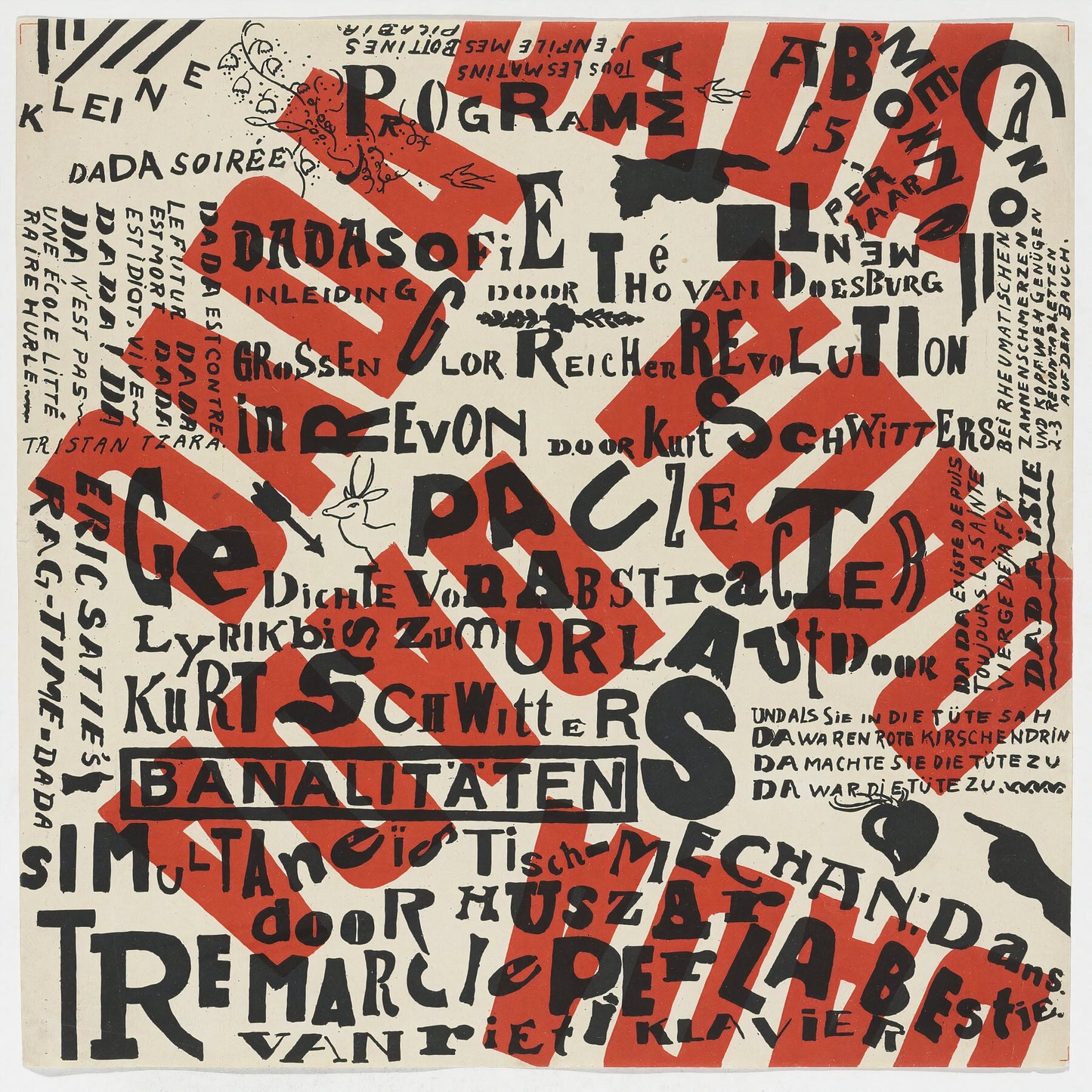
Words collide from every direction across cream paper: programme listings in Dutch, German, and French, names of performers set at every scale, and cutting diagonally through the entire field, the four letters D-A-D-A repeated in dense red block type, again and again. Small found vignettes, a deer, an arrow, a pointing hand, are pressed into whatever space the typography leaves them. There is no hierarchy. There is no margin. Every element competes with every other.
The poster was designed jointly by Theo van Doesburg (Dutch, 1883-1931), founder of De Stijl, and Kurt Schwitters (German, 1887-1948), the Hanover-based Merz artist, for their 1922-23 Dada Campaign: a tour of Dutch cities in which the two artists staged evenings of lectures, sound poetry, and ragtime music by Erik Satie. The programme printed on the sheet includes van Doesburg's 'Dadasofie', Schwitters's abstract verse and 'Urlaut' sound sequences, and simultaneous mechanical dances by Huszar. The poster's chaotic multi-directional composition directly mirrors the structure of those evenings: audience members barked back at the performers, jokes collapsed mid-sentence, and order was the one thing that was never permitted to settle.
Held in the permanent collections of the Museum of Modern Art, New York and the National Gallery of Art, Washington D.C., the Kleine Dada Soiree poster occupies a specific place in the history of graphic design: it is among the earliest works to treat the poster itself as a Dada performance, where every typographic decision is an act of refusal. Van Doesburg brought De Stijl's structural thinking; Schwitters brought Merz's appetite for found material and controlled disorder. The result belongs to neither movement cleanly, which is precisely the point.
Reproduced here as an archival print on 200gsm Enhanced Matte Fine Art Paper. The restrained matte surface and natural white tone suit the stark two-colour palette of the original. A considered choice for any collection of twentieth-century graphic history or avant-garde performance culture.