Vintage Poster Archives
Guinness for Strength 1950s | Vintage Beer Poster
This service is currently unavailable,
sorry for the inconvenience.
Pair it with a frame
Frame options are for visualization purposes only.
FRAME STYLE
MATTING SIZE
BUILDING YOUR EXPERIENCE
powered by Blankwall
Take a few steps back and let your camera see more of the scene.
powered by Blankwall
Was this experience helpful?
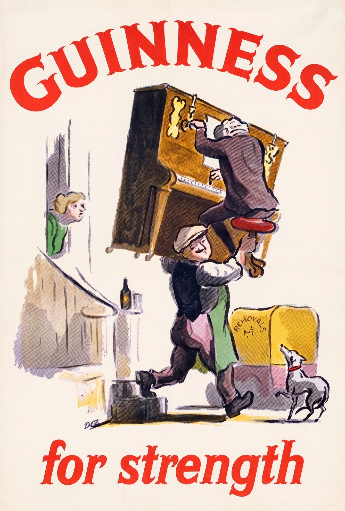
A removal man in flat cap and apron carries a full-size upright piano on his back, a second man riding on top of it. A greyhound trots at their heels; a woman in a green cardigan peers around a door frame; behind them stands a yellow removals van. On the step to the left, a Guinness bottle. The slogan needs no elaboration: 'GUINNESS / for strength', set in bold arched red type above and loose red italic below, on a clean cream ground.
Produced for Arthur Guinness Son & Co. Ltd. through S. H. Benson Ltd., c. 1955. The 'Guinness for Strength' campaign had run since the early 1930s under the art direction of John Gilroy, whose girder-carrying workman became the series' defining image. By the mid-1950s the campaign had expanded into a broader series of comic-vignette designs, of which this piano movers variant is one. It belongs to the second, borderless issue of Guinness strength posters, lighter in tone, looser in line, and rooted in the specifically British humour of removal-day chaos. The monogram DLB appears lower left; the artist has not been conclusively identified in published records.
The composition works through contrast: the sheer scale of the piano against the compact figure carrying it, the placid expression of the carrier against the evident effort, the dog entirely unbothered. Mid-century British advertising at its most confident, built on the understanding that the joke and the product reinforcement are the same thing.
Reproduced on 200gsm Enhanced Matte Fine Art Paper. A natural choice for a kitchen, dining room, or pub-adjacent wall where British commercial illustration of the 1950s is the point.
Couldn't load pickup availability
Share
A removal man in flat cap and apron carries a full-size upright piano on his back, a second man riding on top of it. A greyhound trots at their heels; a woman in a green cardigan peers around a door frame; behind them stands a yellow removals van. On the step to the left, a Guinness bottle. The slogan needs no elaboration: 'GUINNESS / for strength', set in bold arched red type above and loose red italic below, on a clean cream ground.
Produced for Arthur Guinness Son & Co. Ltd. through S. H. Benson Ltd., c. 1955. The 'Guinness for Strength' campaign had run since the early 1930s under the art direction of John Gilroy, whose girder-carrying workman became the series' defining image. By the mid-1950s the campaign had expanded into a broader series of comic-vignette designs, of which this piano movers variant is one. It belongs to the second, borderless issue of Guinness strength posters, lighter in tone, looser in line, and rooted in the specifically British humour of removal-day chaos. The monogram DLB appears lower left; the artist has not been conclusively identified in published records.
The composition works through contrast: the sheer scale of the piano against the compact figure carrying it, the placid expression of the carrier against the evident effort, the dog entirely unbothered. Mid-century British advertising at its most confident, built on the understanding that the joke and the product reinforcement are the same thing.
Reproduced on 200gsm Enhanced Matte Fine Art Paper. A natural choice for a kitchen, dining room, or pub-adjacent wall where British commercial illustration of the 1950s is the point.
