Vintage Poster Archives
David Klein Chicago TWA 1960s | Vintage Airline Poster
This service is currently unavailable,
sorry for the inconvenience.
Pair it with a frame
Frame options are for visualization purposes only.
FRAME STYLE
MATTING SIZE
BUILDING YOUR EXPERIENCE
powered by Blankwall
Take a few steps back and let your camera see more of the scene.
powered by Blankwall
Was this experience helpful?
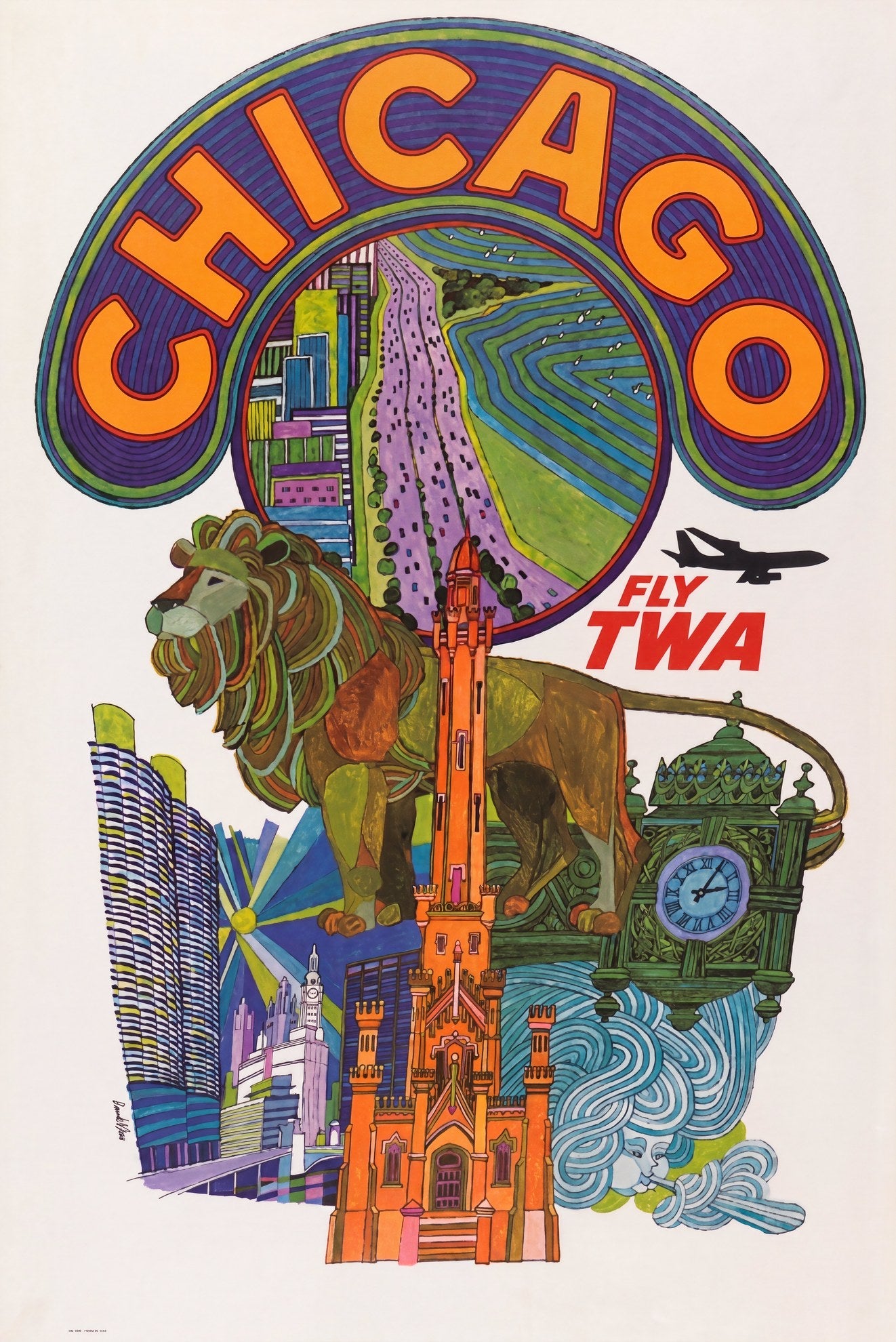
An Art Institute lion, rendered in flat olive-gold with curling mane lines, fills the foreground of this Chicago design by David Klein for Trans World Airlines. Behind it, the Gothic red-brick tower of the Chicago Water Tower rises at centre, with the striped cylinders of Marina City to the left and the ornate Marshall Field's clock to the right. Above everything, a circular medallion draws Lake Shore Drive receding into the distance: flat bands of purple, green and blue, viewed from altitude. In the lower right corner, a wind sprite blows with puffed cheeks, a quiet reference to the city's long-standing reputation. The jet silhouette crossing the upper right is the only literal nod to the airline commissioning the work.
David Klein (1918–2005) produced this design for Trans World Airlines during the late 1960s. The inclusion of Marina City, completed in 1968, anchors the composition to that moment in Chicago's skyline history. Klein's approach across the TWA city series was consistent: abstract the destination's best-known characters into a single flat-graphic frame, saturate the palette, and trust the viewer to make the connection. His 1956 New York poster entered the permanent collection of the Museum of Modern Art in 1957, and the Chicago design applies the same method: stacked landmarks, confident outline drawing, and a palette calibrated to the city's particular character.
The design belongs to the body of American mid-century commercial illustration that defined how the Jet Age sold itself to a new travelling public: bold, flat, and grounded in a genuine illustrator's hand.
Reproduced from an archival source print on 200gsm Enhanced Matte Fine Art Paper with pigment-based inks.
Couldn't load pickup availability
Share
An Art Institute lion, rendered in flat olive-gold with curling mane lines, fills the foreground of this Chicago design by David Klein for Trans World Airlines. Behind it, the Gothic red-brick tower of the Chicago Water Tower rises at centre, with the striped cylinders of Marina City to the left and the ornate Marshall Field's clock to the right. Above everything, a circular medallion draws Lake Shore Drive receding into the distance: flat bands of purple, green and blue, viewed from altitude. In the lower right corner, a wind sprite blows with puffed cheeks, a quiet reference to the city's long-standing reputation. The jet silhouette crossing the upper right is the only literal nod to the airline commissioning the work.
David Klein (1918–2005) produced this design for Trans World Airlines during the late 1960s. The inclusion of Marina City, completed in 1968, anchors the composition to that moment in Chicago's skyline history. Klein's approach across the TWA city series was consistent: abstract the destination's best-known characters into a single flat-graphic frame, saturate the palette, and trust the viewer to make the connection. His 1956 New York poster entered the permanent collection of the Museum of Modern Art in 1957, and the Chicago design applies the same method: stacked landmarks, confident outline drawing, and a palette calibrated to the city's particular character.
The design belongs to the body of American mid-century commercial illustration that defined how the Jet Age sold itself to a new travelling public: bold, flat, and grounded in a genuine illustrator's hand.
Reproduced from an archival source print on 200gsm Enhanced Matte Fine Art Paper with pigment-based inks.
