Vintage Poster Archives
Cold War Peace Movement 1959 | Nuclear Death vs Peace
Cold War Peace Movement 1959 | Nuclear Death vs Peace
Couldn't load pickup availability
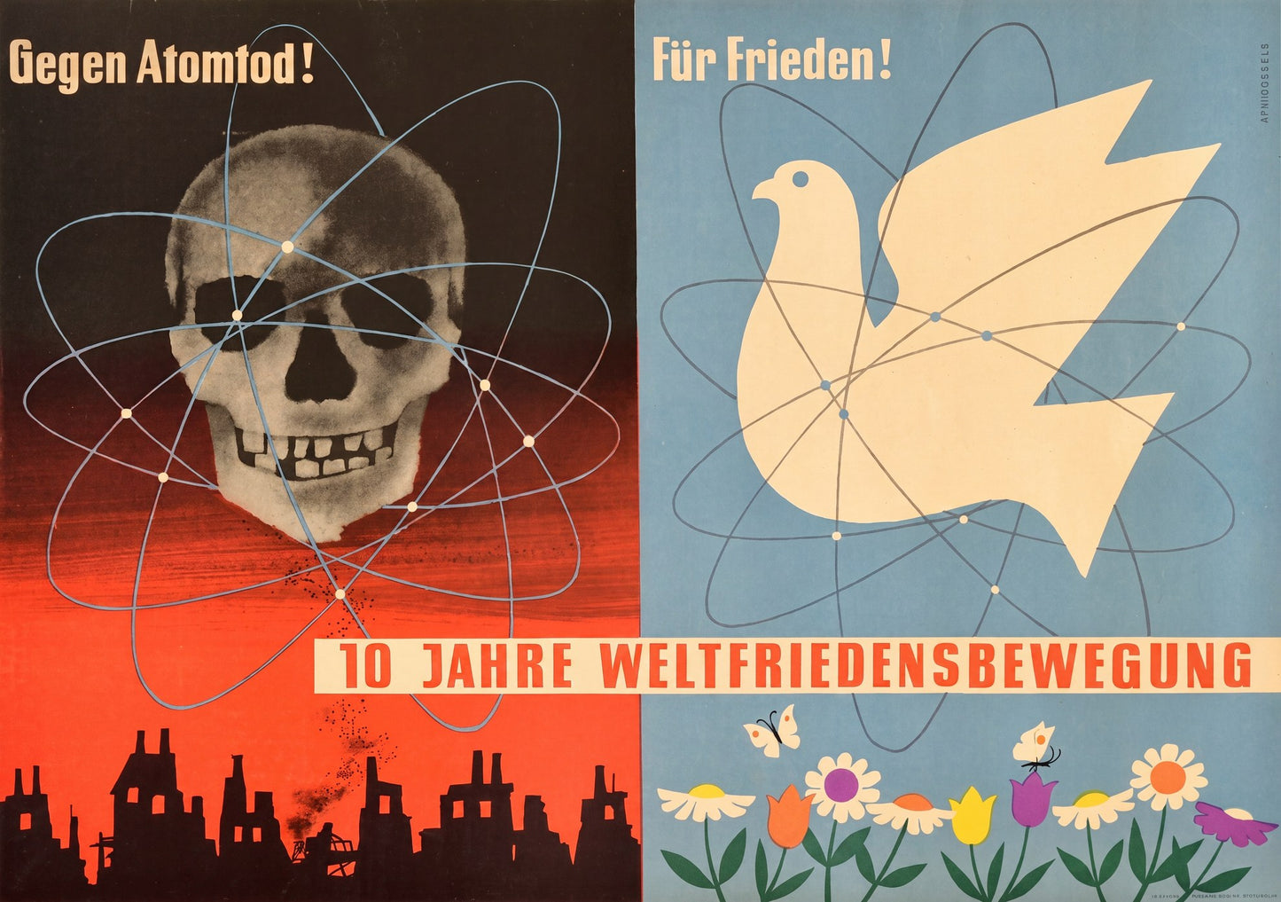
A stark visual manifesto from the height of the Cold War. On the left, a skull surrounded by atomic orbital rings looms above a destroyed cityscape in ominous red and black. On the right, a white dove of peace carries the same atomic symbol against a serene blue sky dotted with flowers.
Commissioned by the German World Peace Movement in 1959, this poster depicts the nuclear anxiety that gripped both East and West. The atomic orbital pattern appears in both panels: as a symbol of destruction and as a symbol of hope. The designer understood that the atom itself was neutral, the choice lay in how humanity would use it.
The bold sans-serif typography declares 'Gegen Atomtod!' (Against Nuclear Death!) and 'F�r Frieden!' (For Peace!) with the commemorative banner '10 Jahre Weltfriedensbewegung' spanning the center. Printed by Graphische Werkst�tten Berlin during Germany's post-war peace movements.
Reproduced as a fine art archival print on 200gsm Enhanced Matte Fine Art Paper. The stark composition resonates with anyone drawn to Cold War history or mid-century graphic design.