Vintage Poster Archives
Bantam Cappello 1938 | Boccasile Fashion Poster
Bantam Cappello 1938 | Boccasile Fashion Poster
Couldn't load pickup availability
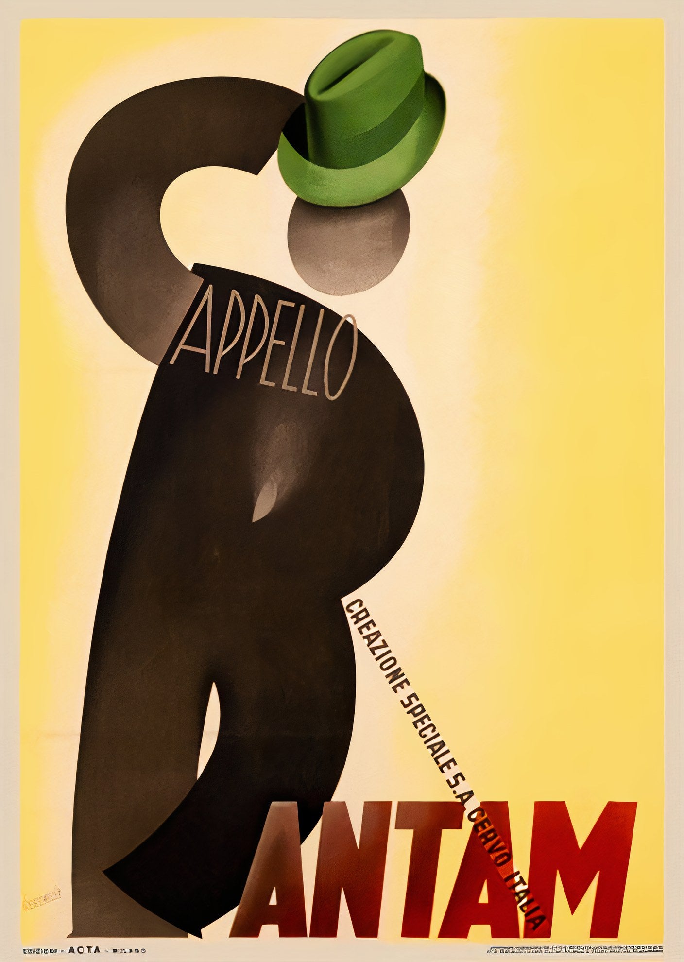
A stylized brown figure topped with a green hat rises against a bright yellow background. The typography 'APPELLO' flows through the curved form, with bold red 'BANTAM' anchoring the base.
Designed by Gino Boccasile for the Italian hat company Bantam in 1938, this poster exemplifies the sophisticated advertising art of the late Art Deco period. Boccasile, trained at the Academy of Fine Arts in Bari, founded his own Milan agency ACTA and became one of Italy's foremost poster artists of the 1930s and 1940s.
The design reduces hat advertising to pure graphic poetry. The figure itself becomes the letter forms, while the actual product sits as the perfect accent above. This approach shows how Italian designers adapted Art Deco principles with a warmer, more organic sensibility than their French counterparts.
Reproduced as an archival print on 200gsm Enhanced Matte Fine Art Paper using museum-quality pigment inks. The clean composition and bold palette anchor any space with mid-century sophistication.